Know Thyself
block print
DRy Point
Mixed Media
Self Portrait
Gallery NightS (sem.1)
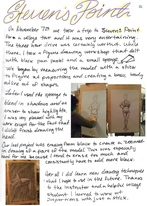
Steven's Point
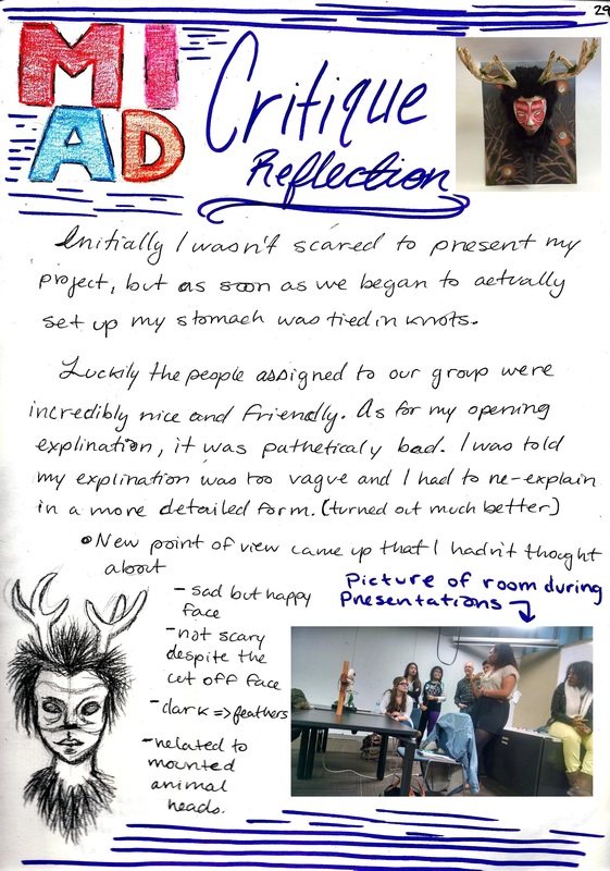
MIAD Critique
Tryptic
Industrial V. Organic
Sacred Vessel
Choice Piece
Gallery Nights (sem 2)
Cycle
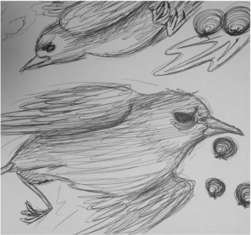
The main idea for this piece was inspired by the concept of death, life and how we as a species come to understand it. A few months ago I noticed a pair of birds building a nest outside my front door. Typically they are taken down by landscapers but I decided to leave it alone and see what would happen. I watched over their nest and saw how their first try failed as they dropped one egg on the porch. At this point I realized that that bird would never see the world, how one mistake by its parents costed it's life. It brought the idea of sadness to my mind and how in that moment I felt sorrow for an animal that never lived. Can we mourn the death of what never was? At this point I considered dropping the nest since I thought no more birds would hatch. To my surprise the birds laid more eggs that eventually hatched.
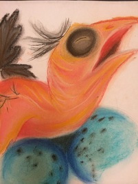
This brought on the idea of painting one canvas with the image of a newly hatched bird to represent birth and how we are officially introduced into the world. These birds lost their first egg but came back stronger with even more eggs that made it. I cared for them until the babies had a full set of feathers. The idea of being attached to animals is so odd yet wonderful. I realized how quick life goes by and how many people are obsessed with being young forever. People don't want to age in order to do something fulfilling with their lives. Although animals tend to live less than humans they seem to enjoy their lives more. Animals don't worry about death they live in the moment and that it something i wanted to show. I wanted to demonstrate how life goes by quickly, kind of like the three images I made. We are born, we grow into our prime adulthood and eventually we die off. It's been going on for years but we still don't seem to be able to accept death for what it is, a true beauty.
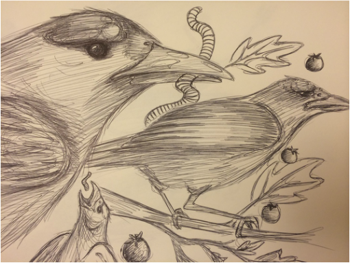
I didn't quite have a set artist inspiration but I used concepts from Francis Bacon and the Baroque art movement. Having studies Bacon's work I was able to add bright colors to contrast the dark background. These colors include yellow and blue against a black background. Although they were not sculptures I attempted to paint the birds with no harsh edges and smooth color transitions. Baroque artwork was very soft looking without hard breaks in between colors. This is also why i refrained from painting clear individual feathers on all three birds. Other small details like the worm and blue eggs are based on the real birds I observed. The first egg that fell was blue with black spots so I added it in as a tribute to the little bird that never had a chance to live and experience death.
J Chair
|
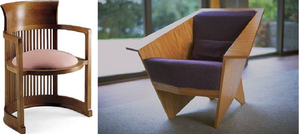
This project was inspired by Frank Lloyd Wright and his architecture as well as his furniture designs. Floyd is known for designing houses filled with furniture also designed by him. A common theme I noticed was dark, earthy colors such as light brown, greens, oranges and in this case blue. This color scheme inspired me to create a slick chair that looks comfortable and simplistic yet slightly detailed. Two chairs influenced my design the most, one is the barrel chair (top left) and the other named the origami chair (top right). It inspired me to create a chair with a curved back while incorporating sharp edges towards the front.
|
|

|
I chose to add the concept of a curve in the back of the chair, rather than going with a circle like in Wright's I chose to use an oval shape. The base did start as a circle but as the levels got higher they began to curve even more in an outwards direction creating ovals. The sides had to be made thinner because if the size was enlarged in proportion the sides would not align very well. The idea behind expanding the back was to create another use for it other than sitting. Therefore the flat top is meant to be used as a table or shelf to place books or decorations.
|

|

The Origami chair inspired the three sided front of the chair to contrast the softer edges on the rest of the chair. Adding this protruding shape in the front of the chair helps in keeping it balanced so the back won't be heavier causing the chair to tilt backwards. I also added a wooden base so the chair can sit flat on the ground as apposed to standing on pegs/ legs. The design aspects were also influenced by what I find appealing and annoying about seating I currently find around me.
Gothic Architecture
|
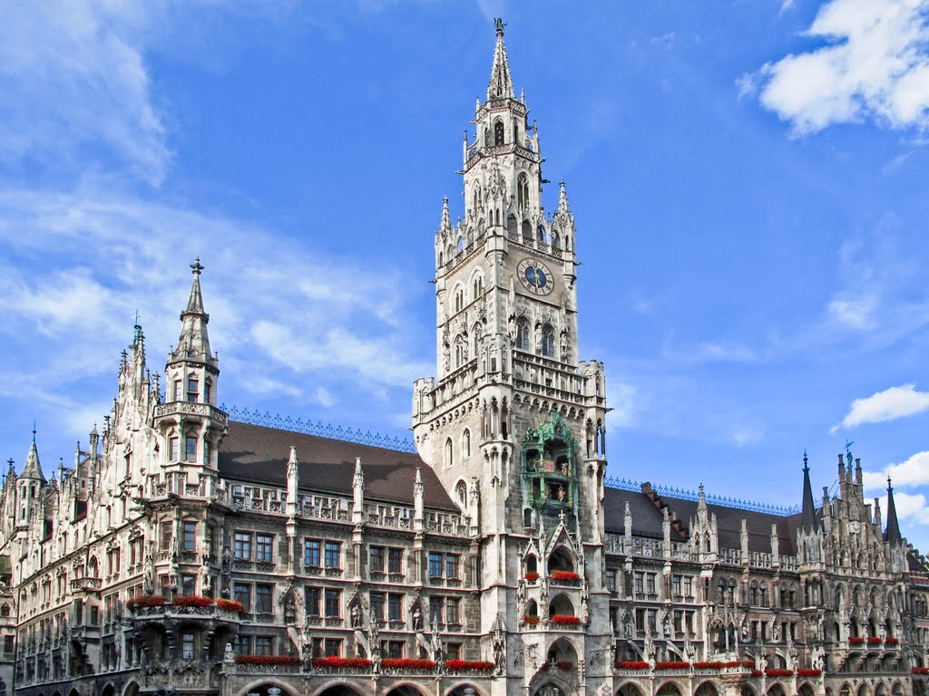
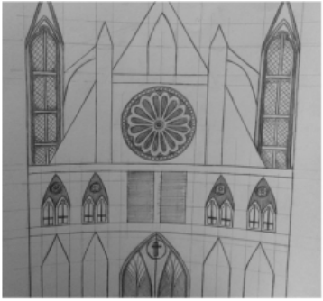
For this project I looked back at what I learned freshman year in the art program. Two point perspective was one of the techniques that caught my attention because it involved a lot of proportions, angles and lines to make detailed streets and buildings. Therefore I used Gothic architecture as inspiration because the buildings are absolutely stunning and intricate. Gothic art was a type of Medieval art that further developed from the Romanesque art period. The main architectural influence was the building Neues Rathaus located in Munich, Germany (top right). Another influence was rose window designs, also a project I learned prior in the art program).
|
|
|
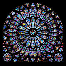
The window I adapted into my own design is the rose window in the Notre Dame cathedral (middle right). I kept the concept of a small circle in the center surrounded by "petals" along with a thin border surrounding it to make it look three dimensional. Most of the design was added and changed along the way depending on how it looked and whether it would end up symmetrical. The three images show my initial sketches and planning using lines and studying the relationship between one object and another. The most difficult aspect of these drawings was imagining a building from an angle and how textures would look on it. Also having to figure out how to draw in different objects that cut each other off without the entire building looking incorrect.
|
|
|

|
Selective Soldier
|
My inspiration for this piece was my older brothers as well as my male friends who have turned 18 years old. Growing up joining the military never really was an option any of my family considered, I always had the idea that it was for those who volunteered to join. Sadly I was later informed all males over the age of 18 had to register for the selective service if we were ever forced into war. The draft suddenly became a terrifying thing for my brothers and friends. The thought of losing people I cared about to war and violence devastated me. As well as the thought of others in the country treating them poorly as they tend to do. So many veterans end up homeless and forgotten despite their miraculous bravery to protect our country. Being a female I was not forced to register, which partially made me feel safe but also made me feel guilty. I wanted to raise awareness to a topic that has been in front of our faces for so long that we've become numb to its horrors. Thousands of men and women are often sent to war with little to no recognition but the love of their relatives or close friends. I wanted to show how I think it would look to be in their shoes, to be scared and looking straight into the unknown. The soldier I chose to draw was originally meant to be male but it can be interpreted as being of either gender depending on the viewer. I also chose to show the back of the soldier to not give away their identity to represent how oblivious and ignorant we've become towards the soldiers who fight for our country. Some conflicting ideas I had were on the color scheme because it seemed that the piece was too yellow for the darker background but I went with it anyway and ended up liking the finished product. As for the smoke clouds I also went back and forth with until settling with a rougher texture as opposed to a smooth rounded cloud of dirt and dust. I feel that the colors blending together creates a good sense of indifference and lack of emotion that fits well with what i'm aiming to create.
|
|
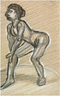
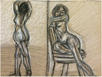
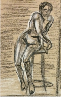
Figure Drawing
|
Now applying to colleges I chose to kill two birds with one stone and try out nude figure drawing of the female form. My inspiration was Leonardo da Vinci and his anatomical drawings showing the intense contours of the body and muscle definition. Although da Vinci focused on male figures, I chose a female model because it is the anatomy I am most familiar with. This piece was done in conte crayons on a piece of paper that is larger and thicker than what I was use to working on. This was also my first time using conte crayons that surprisingly worked a lot like chalk pastels, which I enjoy using, so it wasn't very hard getting use to them. The strong pigments were a bit much for my liking but then they grew on me as I realized that using lighter colors wouldn't accentuate the curves in the body as well as the colors I had could. As for the positioning of the body I wanted to push it towards a single side to create an asymmetrical piece of work. I don't think I quite accomplished this idea because the right side of the paper was nearly blank. The positioning was also off because so much of the models body got cut off, such as the hands and feet. They would've certainly been interesting to draw but over all the head was the hardest part for me to visualize. Because I started off drawing the body on the paper, the head may have turned out slightly off proportion. I tried to use the dark colors to my advantage by creating dark shadows where the light wouldn't touch the model. For highlights I used white because the paper is more of a gray color so the white stood out nicely.
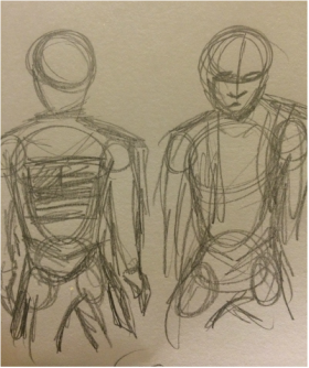
Prior to starting the final drawing I made four small thumbnail sketches from charcoal in my sketchbook. White charcoal and an ebony pencil were used to map out changes in color and shadows. Each pose was in a different position using different props and sometimes none at all. I tried to capture the backside just as much as the front of the model to have more options to chose from. In the end I chose the frontal angle because I wanted the challenge of drawing the different shapes and the face whereas the backside would've consisted of a bare back and legs. In the future I plan to use da Vincis techniques to draw the human anatomy from a deeper level instead of a superficial view point. This idea may be hard to achieve because I doubt i'll have the chance to draw the inside of a human from observation. Odds are i'll accomplish this by using a scientific skeleton and references to anatomy books based on the human body. |
|
